
Crafting a Strong and Functional Visual Identity for REKEN
Building a visual identity for a company that operates in the industrial and machinery sector requires more than aesthetics — it requires functionality, precision and an understanding of how design interacts with real engineering constraints. This case study presents the complete identity system I created for REKEN: from initial logo concepts and custom typography to a full corporate identity package and, later, a comprehensive website design built under tight deadlines.
The Foundation:
Designing a Logo Built for Real Machines
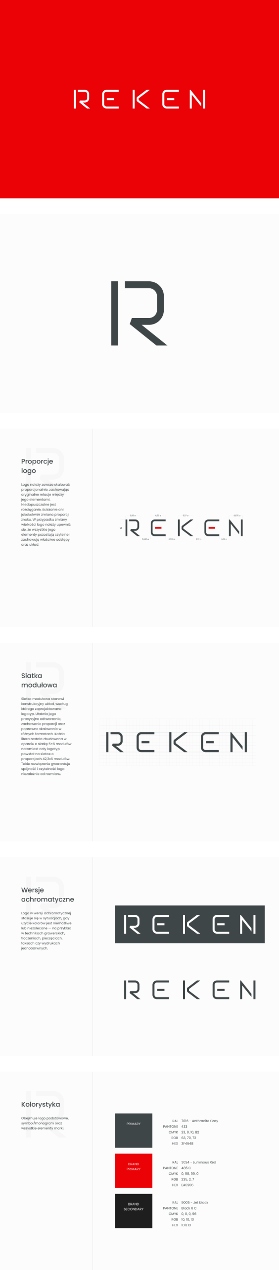
The project began with a clear challenge: the logo not only needed to represent the REKEN brand, it had to be physically manufacturable. The company’s technologist specified that the symbol must be suitable for cutting into metal machine components, which meant the geometry had to remain stable, durable and readable when fabricated from steel sheets or plates.
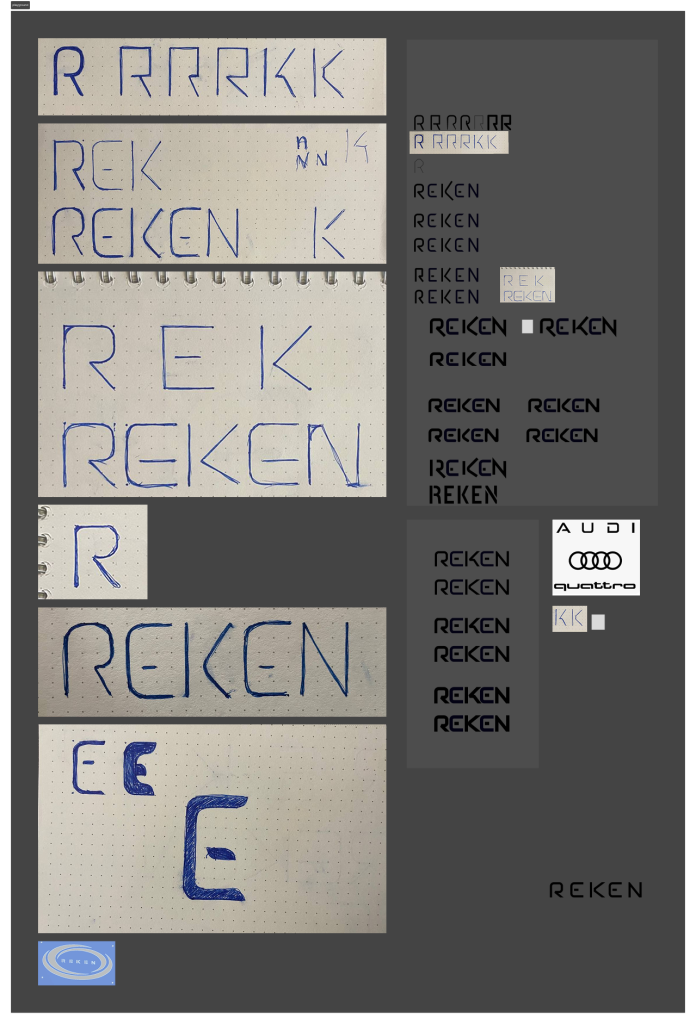
Along with these functional requirements, the brand’s existing red and gray color palette had to be preserved. I began with hand-drawn sketches in a notebook, exploring different directions that balanced technical character with manufacturability. Over the course of the exploration, I developed 12 unique symbol concepts, each designed with industrial constraints in mind.
Ultimately, the client decided to take a more minimal approach and focus on a pure logotype, without an accompanying symbol. This allowed me to craft a fully bespoke letterform system — a custom typographic identity built specifically for REKEN.
Custom Typography & Precision Crafting
After moving the strongest sketches into Figma, I translated them into vector form, refined line weights, adjusted spacing and introduced subtle rounded edges to soften the mechanical character without losing precision.
The final logotype combines:
– industrial strength
– geometric clarity
– clean manufacturability
– modern proportions
Once the logo reached its final form, I prepared a complete brand book, detailing construction rules, safe zones, color guidelines, typographic usage and application examples.
Corporate Identity System
With the logo established, I expanded the identity into the company’s full corporate materials.
This included:
– business cards
– branded folders
– letterheads
– printed and digital templates
– layout standards for future applications
Each element followed the new visual language, ensuring that the refreshed REKEN identity would be consistent across every touchpoint — from internal documents to partner communications.

Website Design:
From Complex Structure to Clear Communication
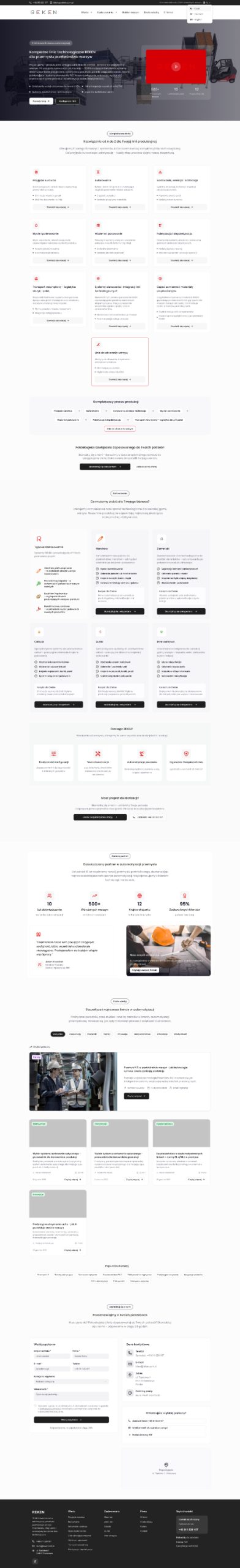
Once the branding phase was complete — and the client was genuinely thrilled with the results — I was commissioned to design the entire REKEN website.
The timeline was tight because the brand needed to present the new identity at an upcoming machinery fair in Hannover. Despite the pressure, the project was executed efficiently and with full attention to detail.
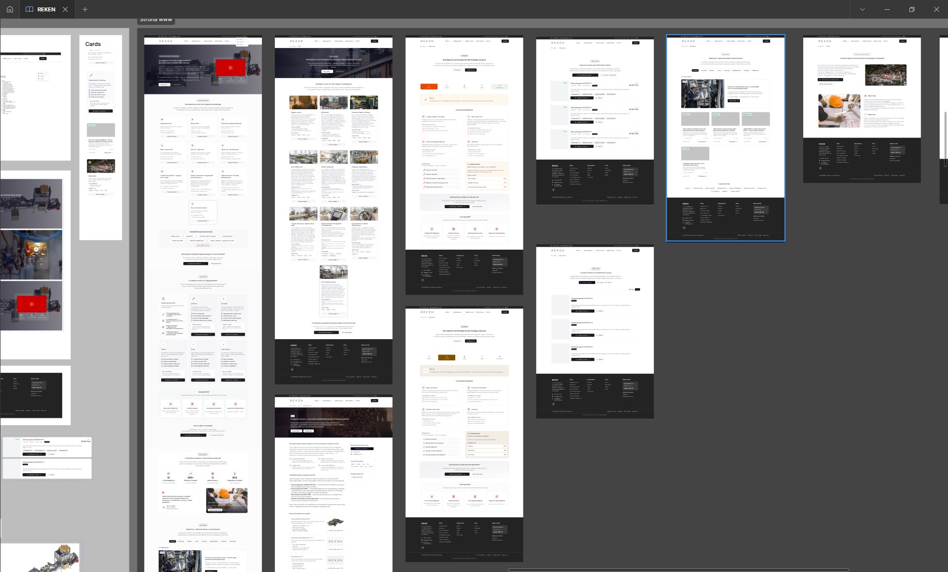
After creating the sitemap, it became clear that the website needed 28 fully designed screens.
The structure included:
– a complete homepage
– 10 offer pages presenting REKEN’s product range
– 5 application-specific pages showcasing where and how machines are used
– a machine marketplace for second-hand equipment
– a blog page
– an “About the company” page
– a contact page
– a full machine configurator page
I began with wireframes to ensure clarity of structure, and then progressed into polished UI design using the newly created branding. The end result is a modern, clean and highly functional website that communicates technical content with precision and confidence.
Additionally, I developed product sheets and presentation materials, all aligned with the freshly built brand identity.
Process Mapping & Supporting Materials
Throughout the project, I created a wide set of assets and supporting materials that extended the new REKEN brand:
– layout systems for website modules
– typography rules for digital and print
– color usage guidelines for different surfaces and backgrounds
– product cards and informational materials
– UI components aligned with the visual identity
All of these elements were designed to maintain a strong, cohesive brand presence — whether viewed on machinery at an exhibition, on printed documents or within the digital ecosystem.
Conclusion
The REKEN identity project demonstrates how thoughtful design can bridge the gap between engineering requirements and modern visual communication. From a logo designed to be physically cut into metal, through an extensive corporate identity system, all the way to a large-scale website completed under challenging time constraints — the entire process shows the value of precision, consistency and understanding the real-world context in which a brand operates.
The Process
Building a clear digital identity for a company in the robotics and industrial automation sector requires a structured and thoughtful approach. My work for Domasz Robotics combines design, content architecture, technical understanding and long-term SEO strategy. The entire process — from the first analysis to the launch — ensures that complex engineering solutions are presented in a way that is accessible, consistent and beneficial for customers looking for palletizing systems or REKEN machinery.
Stage 1.
Understanding functional constraints.
Analyze fabrication requirements, existing brand expectations and industrial limitations to define the boundaries for the new identity.
Stage 2.
Exploration & custom letterform design.
Create hand sketches, refine vector forms, develop 12 concepts, craft the final logotype and prepare the brand book.
Stage 3.
Building the corporate identity. Design business cards, folders, templates and communication materials aligned with the new visual language.
Stage 4.
Website design & implementation. Develop the sitemap, wireframes and high-fidelity designs for 28 screens — including the offer, applications, marketplace and configurator — followed by content creation and product materials.
Want to see more?